시각화 : Visualizaion

Matplotlib
!pip install matplotlib

import matplotlib.pyplot as plt

Matplotlib의 2가지 인터페이스
1. Stateful 인터페이스
- Matplotlib이 암묵적으로 현재 상태를 들고 있음
- 내부적으로 현재 타겟이 되는 figure, ax 등을 설정하고, operation이 발생하면 '내부'에서 해당 figure, ax에 적용함
- 사용은 비추
내부적으로 변화를 적용하기에 직관적이지 못함
다수의 plot을 한번에 그리기 어려움
x = [-3, 5, 7]
y = [10, 2, 5]

plt.figure(figsize=(15, 3));
# ;  : semi-colon 각각의 함수들이 아웃풋창에 안 나오게 하기 위해
# figure : figure를 명시적으로 만든다 (15 : 가로, 3 : 세로)

plt.plot(x, y);
# plot

plt.xlim(0, 10);
# x limit, range 명시 : 0~10
plt.ylim(-3, 8);
# y limite, range 명시
plt.xlabel('X Axis');
# x 축 이름
plt.ylabel('Y axis');
plt.title('Line Plot');
# plt의 타이틀
plt.suptitle('Figure Title', size=10, y=1.03);
#
* 삼성전자 종가 차트 만들기
plt.plot(
    samsung_df.index,
    samsung_df['Close']
)
* 2. Stateless 인터페이스 (or object-oriented)
- Matplotlib의 각 component를 하나의 object로 받아서, 함수 실행 및 property 설정/변경
figure, ax를 먼저 생성한 다음, 하나하나 더하고, 적용하는 식
- 적용과정이 명시적으로 코드로 드러나기 때문에 더 직관적임
x = [-3, 5, 7]
y = [10, 2, 5]

fig, ax = plt.subplots(figsize=(15, 3))

type(fig)
type(ax)
# matplotlib.figure.Figure
# matplotlib.axes._subplots.AxesSubplot

ax.plot(x, y);
ax.set_xlim(0, 10);
ax.set_ylim(-3, 8);
ax.set_xlabel('X axis');
ax.set_ylabel('Y axis');
ax.set_title('Line Plot');
fig.suptitle('Figure Title', size=10, y=1.03);

fig
OOP 방식으로 익히는 것이 확장성 및 추후 새로운 visualization lib에 대해 익힐 때 도움이 많이됨
Matplotlib의 시각화 components
fig, axes = plt.subplots(nrows=2, ncols=2, figsize=(10, 10))
axes[0][0].get_children()

# [<matplotlib.spines.Spine at 0x28196324a90>,
# <matplotlib.spines.Spine at 0x28196324bb0>,
# <matplotlib.spines.Spine at 0x28196324cd0>,
# <matplotlib.spines.Spine at 0x28196324df0>,
# <matplotlib.axis.XAxis at 0x28196324a30>,
# <matplotlib.axis.YAxis at 0x2819632f340>,
# Text(0.5, 1.0, ''),
# Text(0.0, 1.0, ''),
# Text(1.0, 1.0, ''),
# <matplotlib.patches.Rectangle at 0x2819633db80>]
- spines : axes를 둘러싸는 border
- axis : x,y축 (ticks, labels 를 가지고 있음)
* 삼성전자 종가/거래량 시각화
data = fdr.DataReader("005930", start="2019-01-01", end="2020-01-01")
close_series = data['Close']
volume_series = data['Volume']

fig, axes = plt.subplots(nrows=2, ncols=1, figsize=(14,10), sharex=True)
ax1 = axes[0]
ax2 = axes[1]

# ax1
ax1.plot(close_series.index, close_series, linewidth=2, linestyle='--', label="Close");
_ = ax1.set_title('Samsung price', fontsize=15, family='Arial');
_ = ax1.set_ylabel('price', fontsize=15, family='Arial');
_ = ax1.set_xlabel("date", fontsize=15, family='Arial');
ax1.legend(loc="upper left");

# ax2
ax2.bar(volume_series.index, volume_series, label="volume");
_ = ax2.set_title('Samsung volume', fontsize=15, family='Arial');
_ = ax2.set_ylabel('volume', fontsize=15, family='Arial');
_ = ax2.set_xlabel("date", fontsize=15, family='Arial');
ax2.legend(loc="upper left");

fig.suptitle("<Samsung>", fontsize=15, family='Verdana');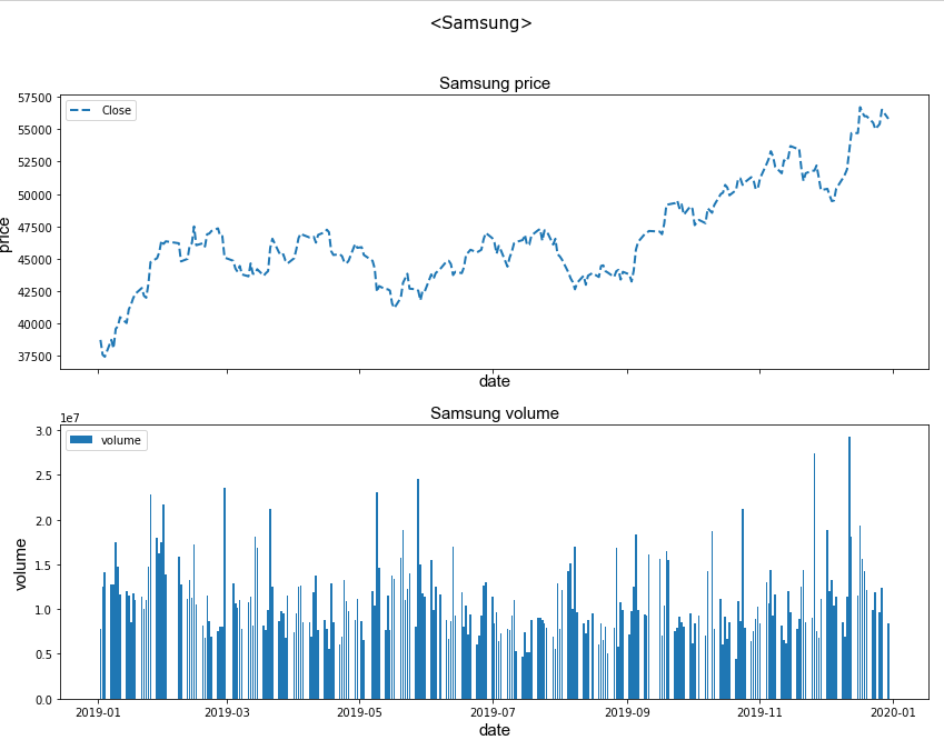
Pandas로 바로 시각화하기
DataFrame, Series는 plot()을 호출하면, 내부적으로 matplotlib api를 호출함
plot을 시행한 후 ax를 return함
matplotlib arg는 그대로 전달 가능
plot의 종류 : bar, line, scatter, hist, box, etc...
import FinanceDataReader as fdr

samsung_series = fdr.DataReader("005930", "2017-01-01", "2018-01-01")['Close']
kodex_series = fdr.DataReader("069500", "2017-01-01", "2018-01-01")['Close']

price_df = pd.concat([samsung_series, kodex_series], axis=1)
price_df.columns = ["삼성전자", "KODEX 200"]
price_df.head()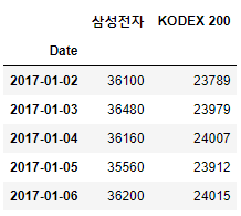
price_max_df = price_df.groupby(price_df.index.month).max()
# 월 中 최대값
fig, (ax1, ax2, ax3) = plt.subplots(1, 3, figsize=(16, 4))

price_max_df.plot(ax=ax1, kind='line');
price_max_df.plot(ax=ax2, kind='bar');
price_max_df.plot(ax=ax3, x='삼성전자', y='KODEX 200', kind='scatter');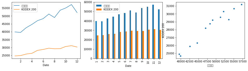
price_df.pct_change() # => p2/p1 - 1
# 전일 대비 변동성
fig, (ax1, ax2, ax3) = plt.subplots(1, 3, figsize=(16,4))

price_df.pct_change().plot(kind='kde', ax=ax1, title='kde');
price_df.pct_change().plot(kind='box', ax=ax2, title='box');
price_df.pct_change().plot(kind='hist', ax=ax3, title='hist', bins=30);
fig, (ax1, ax2, ax3) = plt.subplots(1, 3, figsize=(16,4))

# x : 삼성전자
price_df.pct_change().plot(x="삼성전자", kind='kde', ax=ax1, title='kde');
price_df.pct_change().plot(x="삼성전자", kind='box', ax=ax2, title='box');
price_df.pct_change().plot(x="삼성전자", kind='hist', ax=ax3, title='hist', bins=30);
* matplotlib에서 한글 font 가능하게 설정
- Window: https://financedata.github.io/posts/matplotlib-hangul-for-windows-anaconda.html
- Mac OS / Linux : http://corazzon.github.io/matplotlib_font_setting
import matplotlib.font_manager as fm

for f in fm.fontManager.ttflist:
    if 'Gothic' in f.name:
        print((f.name, f.fname))

# ('MJemokGothic', 'C:\\Windows\\Fonts\\MK.TTF')
#('Malgun Gothic', 'C:\\Windows\\Fonts\\malgunbd.ttf')
#('Franklin Gothic Book', 'C:\\Windows\\Fonts\\FRABK.TTF')
# ...

plt.rcParams["font.family"] = 'AppleGothic'
'Quant' 카테고리의 다른 글
| Quant : Backtesting - 재무제표 기반 (0) | 2022.04.27 |
|---|---|
| Quant : Visualization - Seaborn (0) | 2022.04.13 |
| Quant : Pandas - 데이터 합치기 (0) | 2022.04.05 |
| Quant : Pandas - Grouping (0) | 2022.03.27 |
| Quant : Pandas - API(2) (0) | 2022.03.15 |


